Dentalcare.com
Transforming a fragmented global B2B education platform into a streamlined, persona-driven experience for dental professionals
A platform serving many — satisfying none
Dentalcare.com is a global B2B platform owned by P&G, serving dental professionals with continuing education courses, certifications, and research content — while subtly promoting P&G's oral care brands. With millions of potential users across multiple geographies and professional contexts, the stakes were high.
The challenge: the platform tried to serve everyone — dental students, dental staff, and practicing professionals — with the same navigation, the same content architecture, and the same homepage. The result was a site that frustrated all three groups.
Finding the signal in the noise
We ran a multi-method research program: user interviews with dental professionals across all three persona types, moderated usability testing on the existing platform, a content audit of 200+ page types, and an SEO analysis to understand organic discovery patterns.
The research surfaced four compounding problems: navigation was a maze, pages were too dense to scan, cross-linking broke user flow, and the platform failed to cross-sell P&G products meaningfully. Each problem amplified the others.
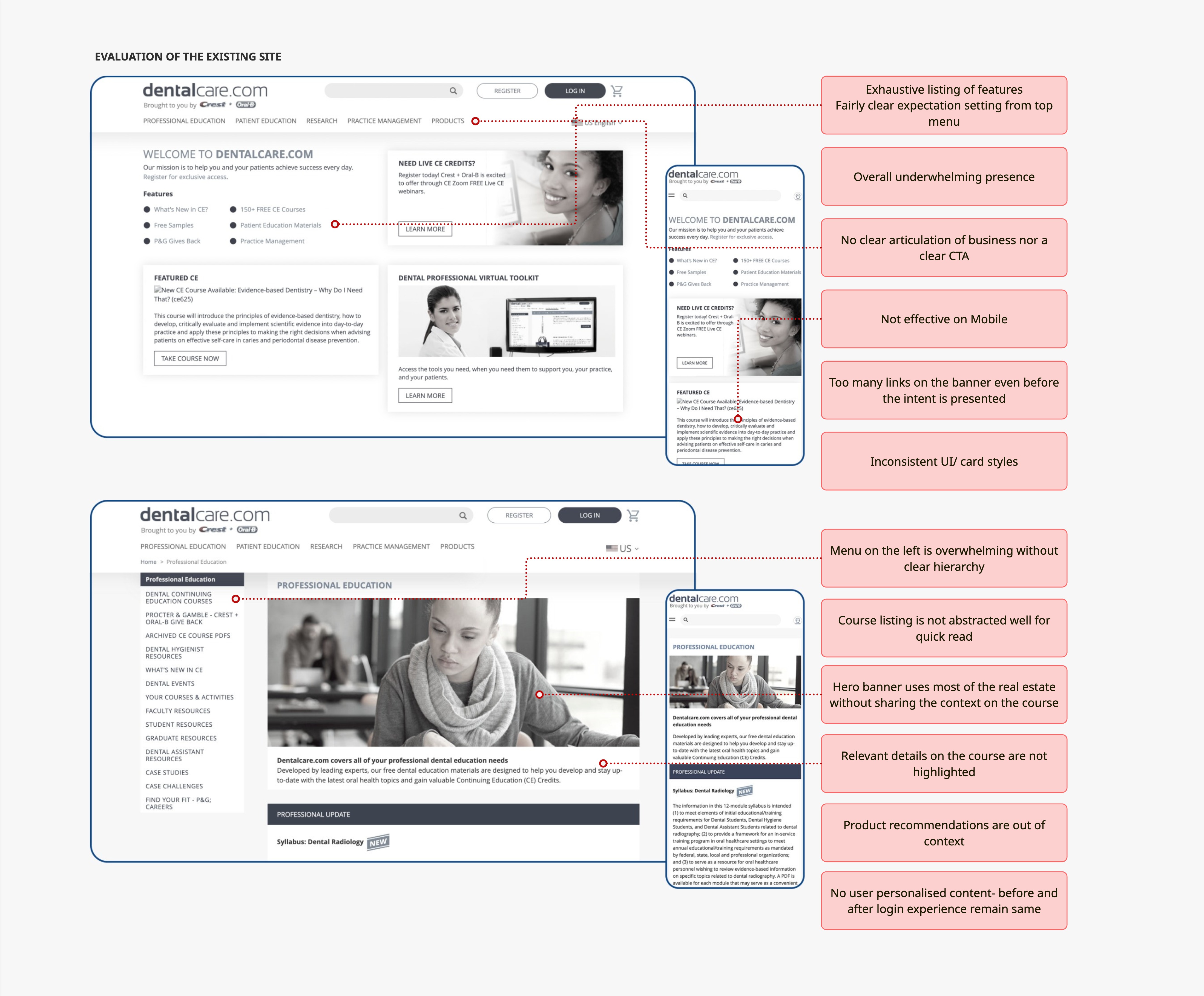
Three distinct users, one platform
The fundamental IA problem was that the existing platform treated all dental professionals as one group. Our research revealed three meaningfully different user types with different goals, time constraints, and content needs. The redesign was structured around serving each of them distinctly.
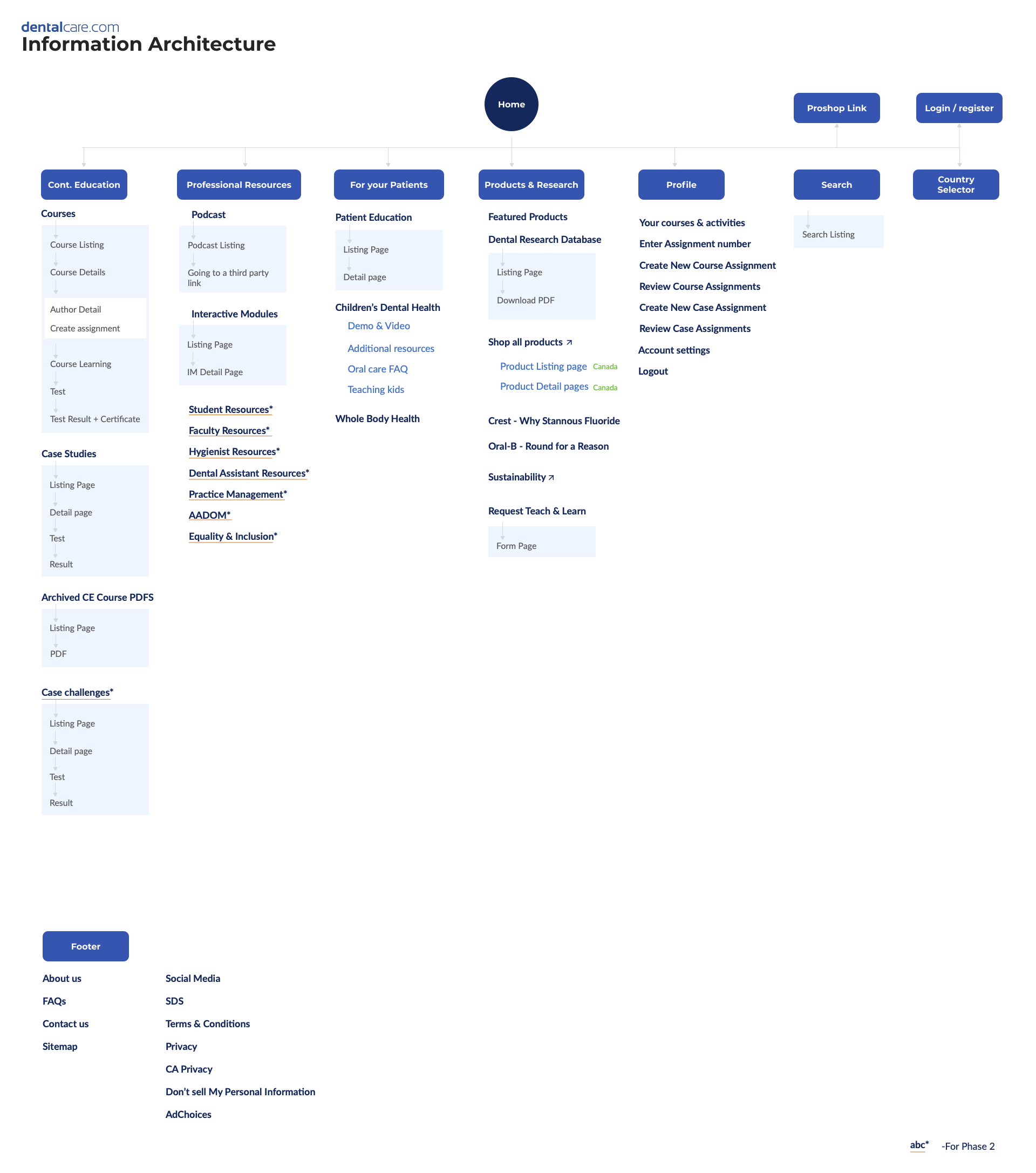
Rebuilding the foundation
The biggest structural change was moving from a content-first architecture (organised around what the platform had) to a user-first architecture (organised around what each persona came to do).
I audited every major page type — homepage, course listing, course details, case studies, research, patient education, articles, product details — and for each asked: who is this for, what are they trying to do here, and where do they go next? This produced a comprehensive opportunity map that became the blueprint for the redesign.
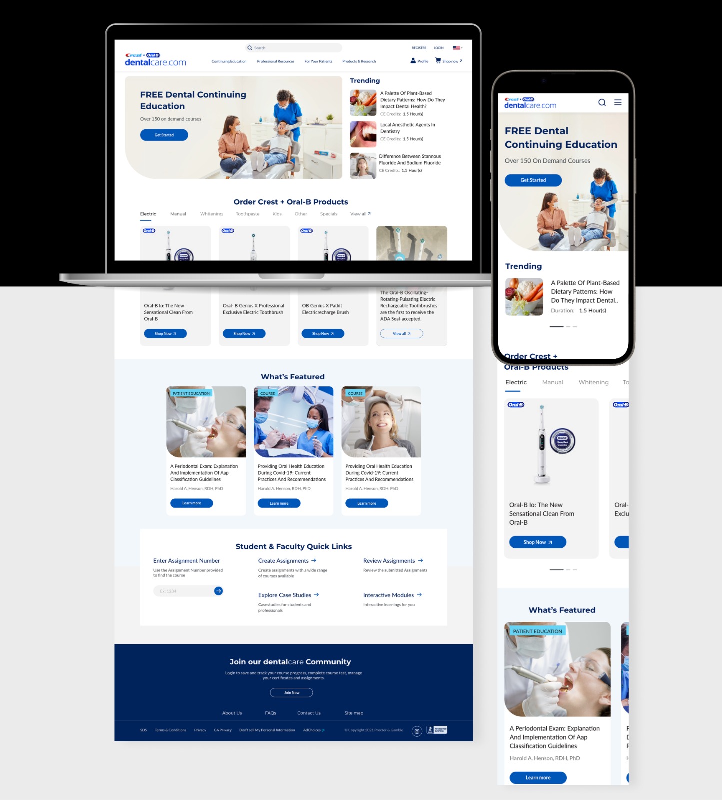
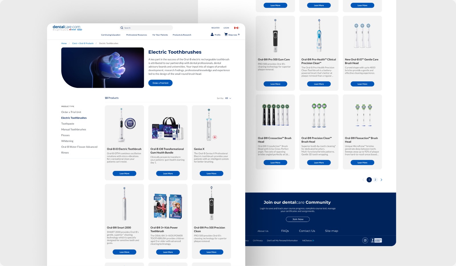
The new Dentalcare.com
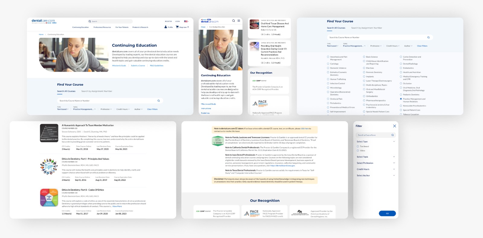
The new homepage establishes value immediately for each persona type, with clear entry points into the content streams most relevant to them. The course discovery experience was entirely rebuilt — with a dedicated search function, filters by author, duration, and specialty, and a course detail page that sets clear expectations upfront.
The cross-selling integration was the most strategically important change: instead of treating product promotion as a banner layer on top of educational content, we embedded product suggestions contextually within articles and courses — reinforcing brand credibility by aligning products with professional learning moments rather than interrupting them.
Built for a global audience
Dentalcare.com serves dental professionals across multiple geographies, languages, and devices. The redesign was built with accessibility and internationalisation as first-class requirements — not post-launch additions.
Results across every metric
The redesigned platform delivered measurable improvements across all primary success metrics within 6 months of launch: 40% increase in user engagement through contextually relevant course recommendations, 15% lift in cross-sell conversion through contextual product integration, and a 30% reduction in drop-off through simplified navigation and reduced cognitive load.
The persona-based entry points became the most immediately impactful structural change — first-session task completion rates improved significantly across all three user types, because each persona now had a clear path into the content most relevant to them.