INNCOM Direct
Energy management solutions for mid-segment hotels — bringing smart building technology to properties that couldn't previously access it
A market left behind
Hotel brands worldwide were raising the bar for energy efficiency and sustainability. They needed smarter tools to track and manage energy use across properties. INNCOM technology offered powerful monitoring and control — but only luxury hotels could access it. Its high cost and complexity locked out mid-range properties, which represent the largest segment of the hospitality market.
Our mission: make it easier for mid-range hotels to manage their properties efficiently, reach sustainability goals faster — without compromising guest comfort.
Learning from the field
We started by exploring how existing solutions were being used in the real world. I partnered with our UX researcher to conduct contextual interviews with facility managers and installation engineers — focusing on setup pain points and day-to-day monitoring challenges.
I then facilitated a design workshop with facility managers, dealers, offering leads, and application engineers. Their hands-on experience helped us map the gaps between what the current solution provided and what the market actually needed.
From insight to architecture
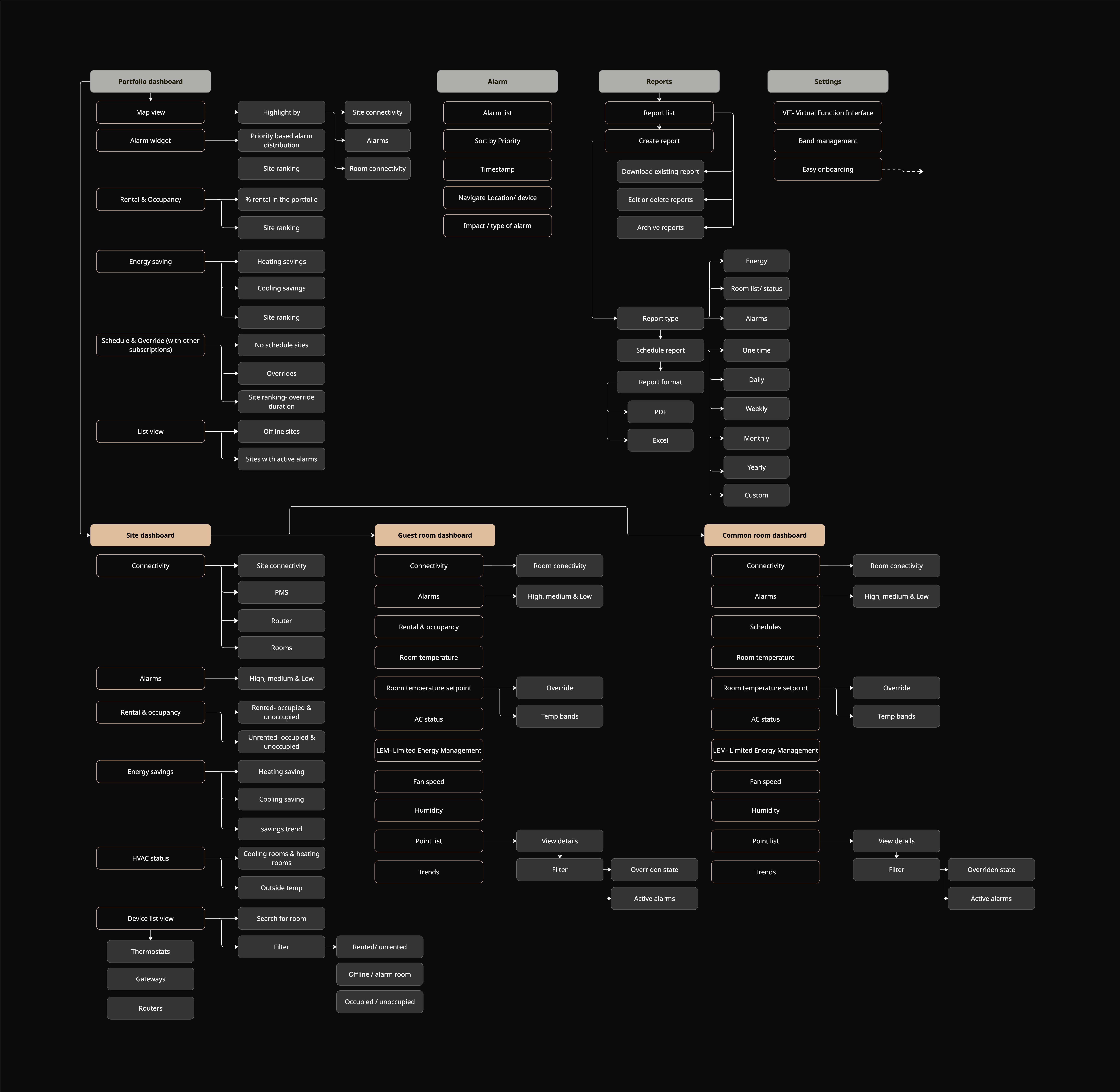
With our research synthesised, I defined the information architecture before touching visual design. The key structural decision: build the dashboard around a portfolio-first hierarchy — properties → sites → rooms → devices — rather than the device-first structure of the legacy system.
Designing for action
The core design principle was: don't just show data — empower users to act on it. Every KPI in the dashboard had to be tied to a decision. If users couldn't act on a piece of information, it didn't earn its place.
This KPI-to-action mapping became our design filter throughout the process. It forced clarity on priorities — and why they mattered — which significantly accelerated stakeholder alignment during reviews.
Three principles guided every screen:
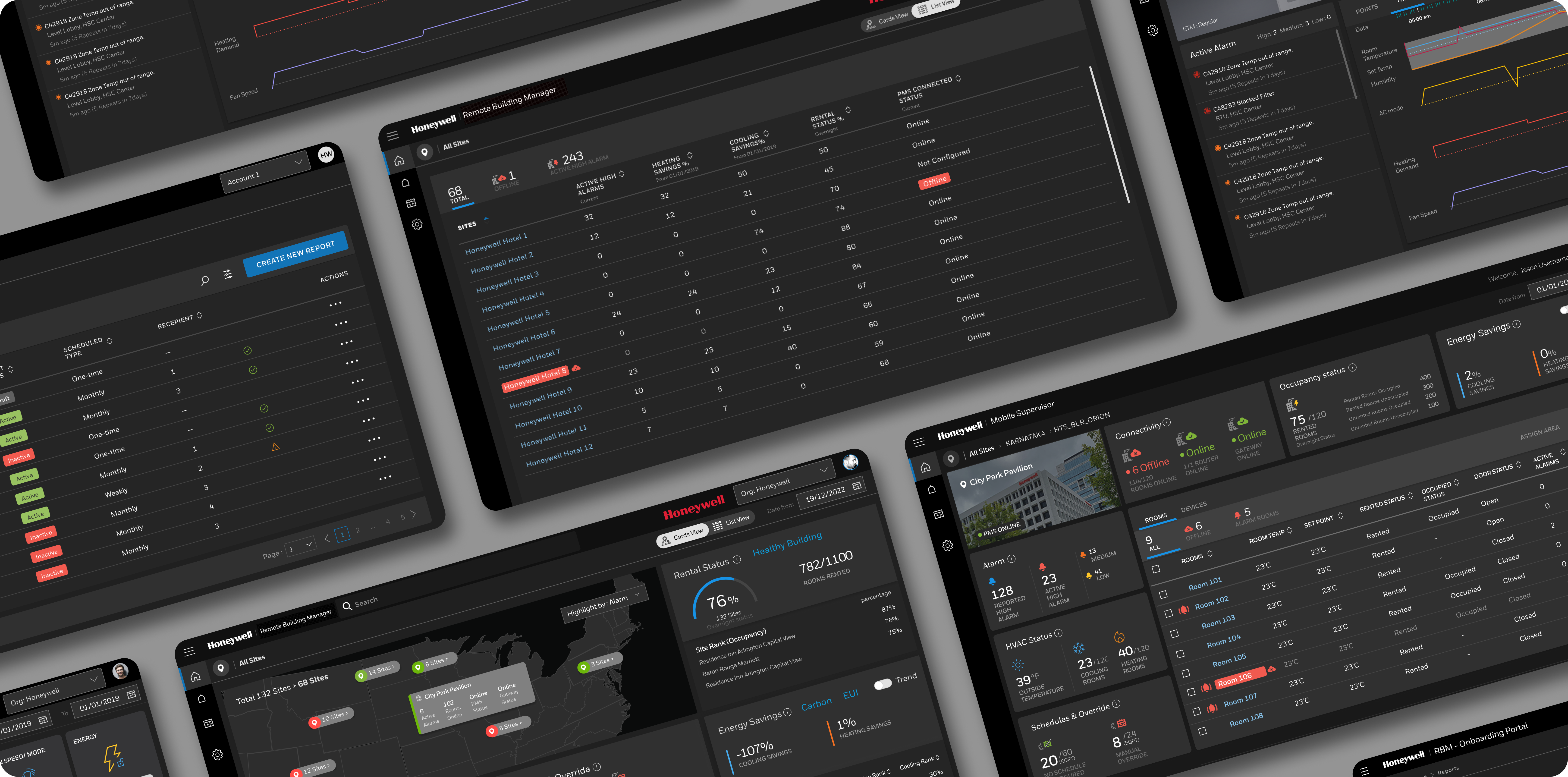
Portfolio Dashboard
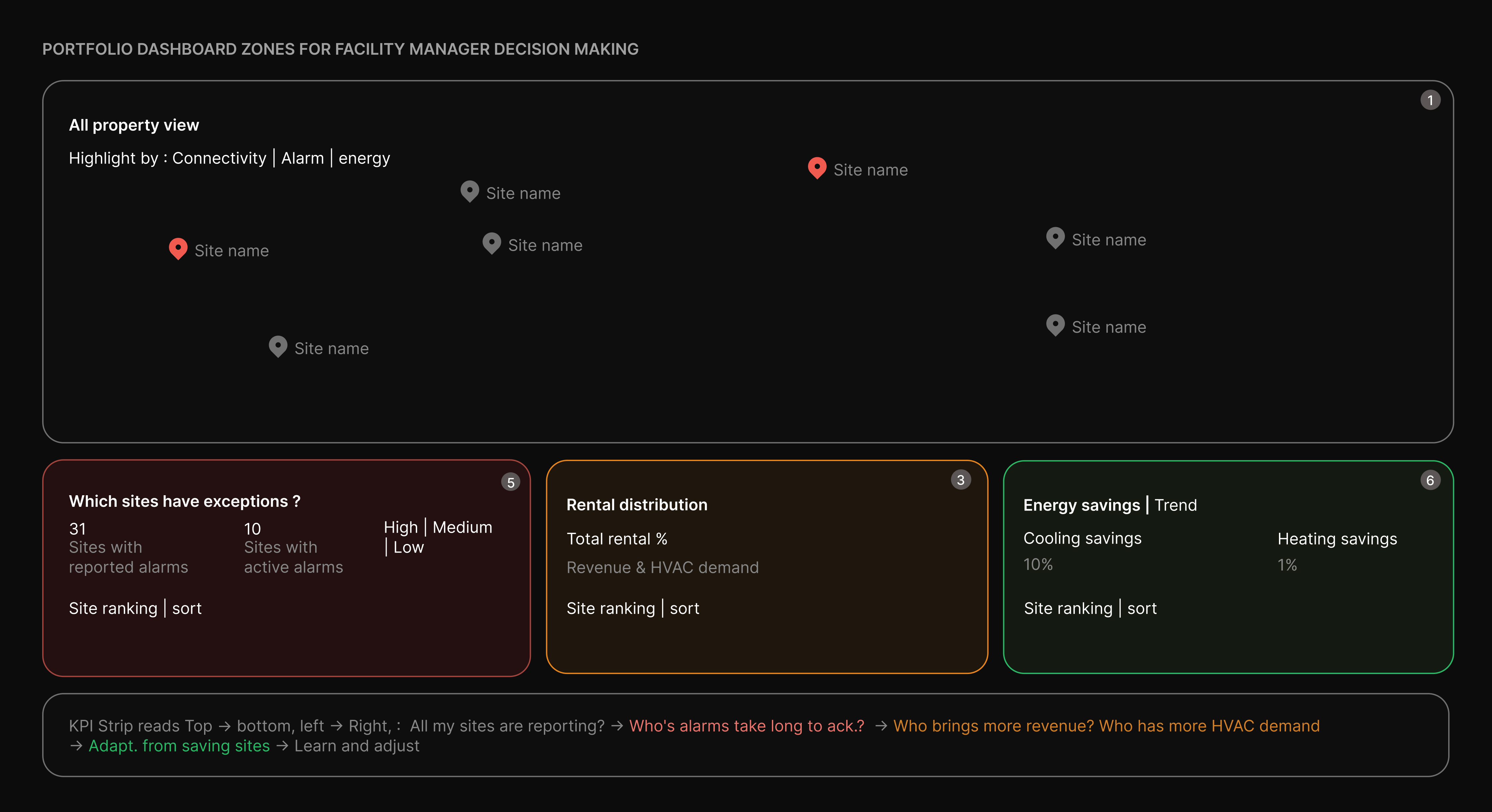
1. Map — spatial pattern recognition before data reading
Instantly reveals whether issues are clustered or scattered. Clusters indicate systemic problems; scattered pins indicate isolated failures. “Highlight by” enables multi-dimensional pattern spotting in the same spatial context. Built for triage, not deep analysis.
2. Alarm widget — from volume signal to accountability ranking
Transforms alarm counts into a performance ranking across sites. Highlights where issues persist vs get resolved, separating operational noise from management gaps.
3. Rental status — connecting revenue, occupancy to HVAC load
Links revenue occupancy with HVAC demand. Energy performance is read in context of occupancy, enabling fair comparison across sites.
4. Energy savings — ROI accountability and best-practice propagation
Surfaces programme performance at a glance. Separates heating and cooling to expose true efficiency gaps. Site comparisons identify best practices and priority interventions; trends show direction of performance.
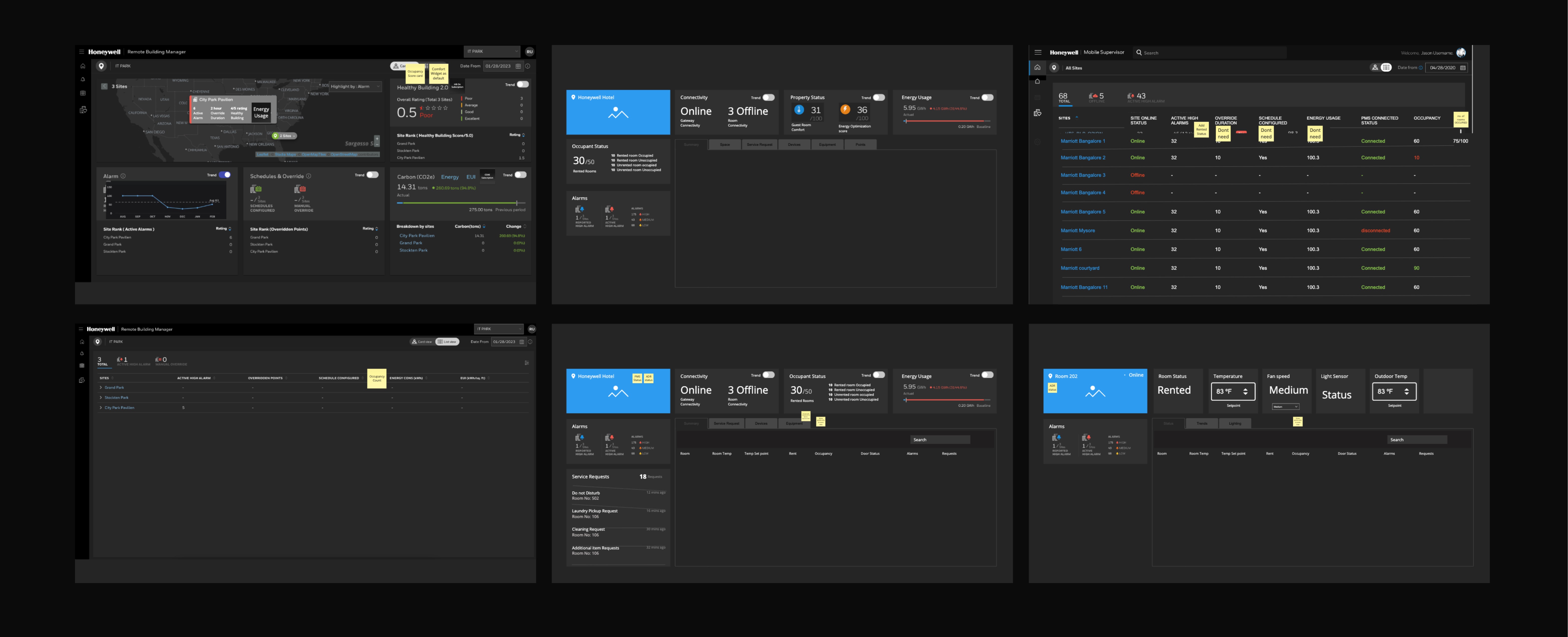
Site Dashboard
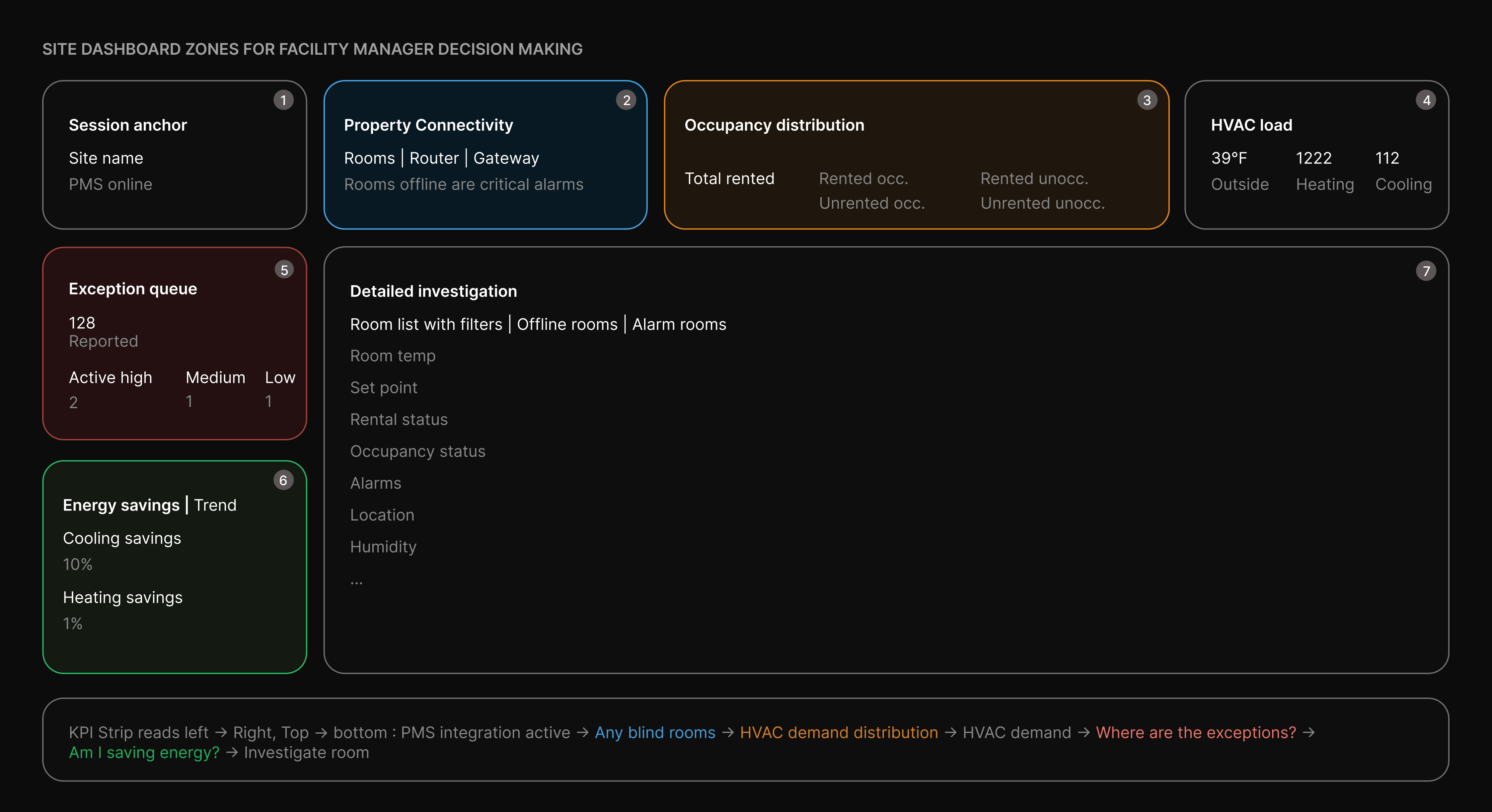
1. Site identity + PMS sync — is the data I'm seeing live?
PMS Online acts as a data-trust gate. If disconnected, occupancy and rental data across the dashboard become unreliable. Positioned top-left to ensure the FM validates data freshness before taking action.
2. Connectivity — which rooms are blind to the system?
Breaks down failures across thermostat, router, and gateway levels — each with distinct causes and owners. Prevents misdiagnosis and ensures correct prioritisation. Connectivity must be resolved before trusting alarms or energy metrics.
3. Occupancy distribution — where should HVAC effort go?
The Rented/Unrented × Occupied/Unoccupied matrix defines HVAC strategy. Highlights where to apply comfort, setback, or standby — and flags anomalies like occupied unrented rooms.
4. Energy savings — my energy bands are actually saving?
Separates heating and cooling to reflect seasonal performance. Reveals underperforming modes instantly, while trends provide a trajectory for audits and accountability.
5. HVAC load — is the system working as hard as it should?
Correlates outdoor temperature with heating/cooling demand. Exposes mismatches that signal configuration issues or data lag before triggering deeper investigation.
6. Alarm panel — property-wide exception triage
Distinguishes active vs reported alarms to reveal true workload. Severity distribution and live feed enable quick prioritisation without diving into room-level data.
7. Room list — site-to-room drill-down surface
Direct bridge from insights to action. Filters map to key issues (offline, alarms), enabling
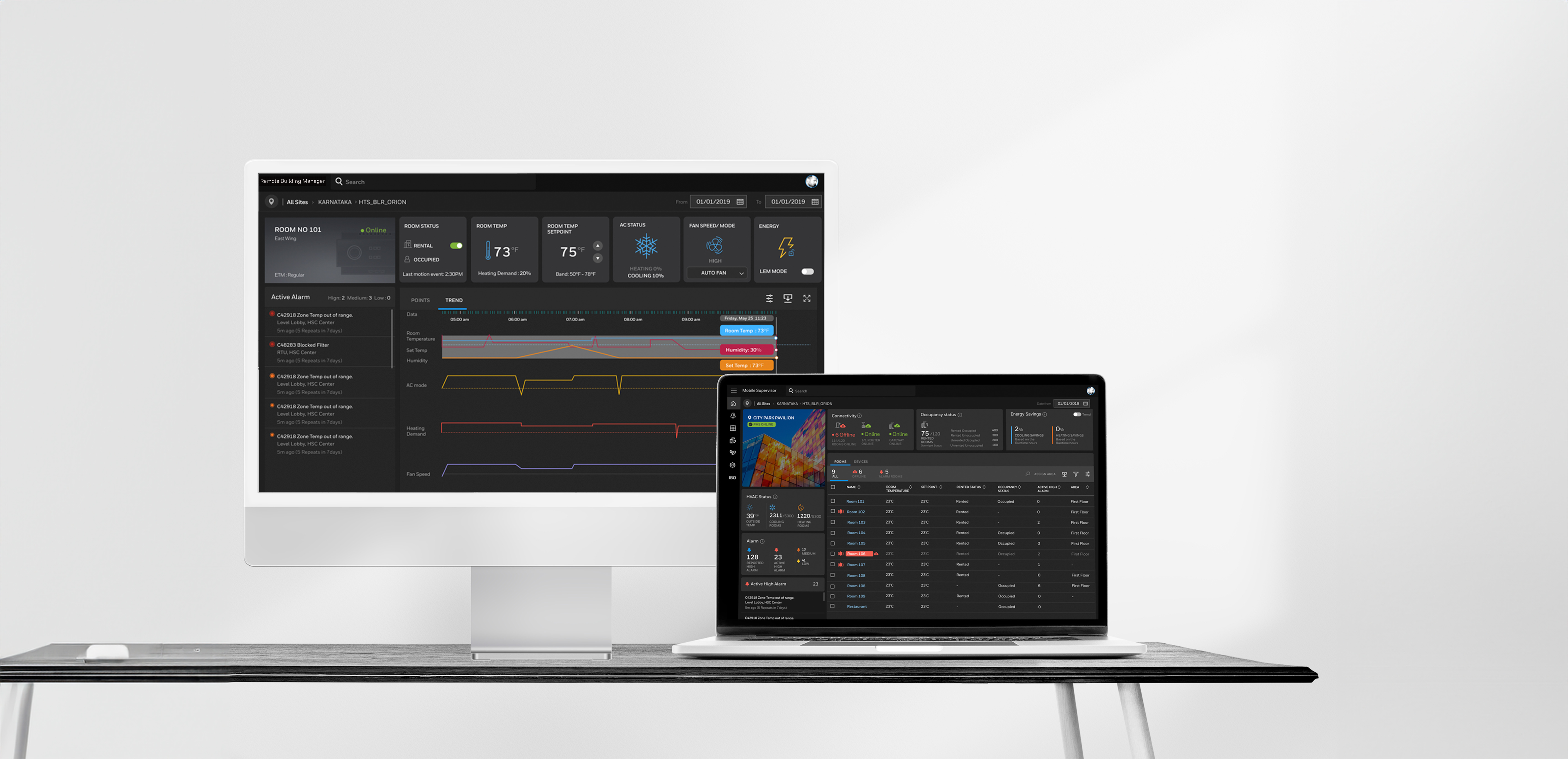
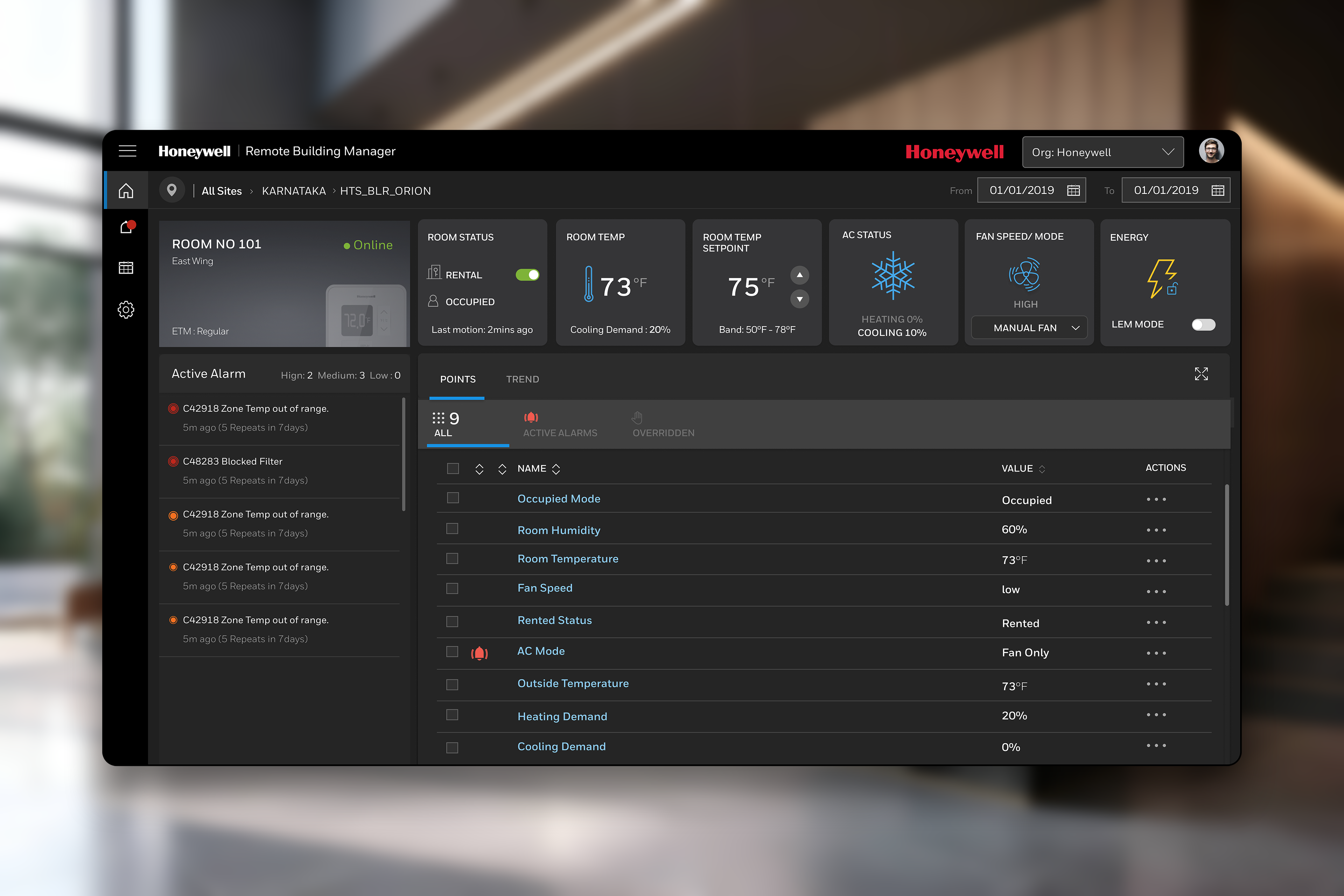
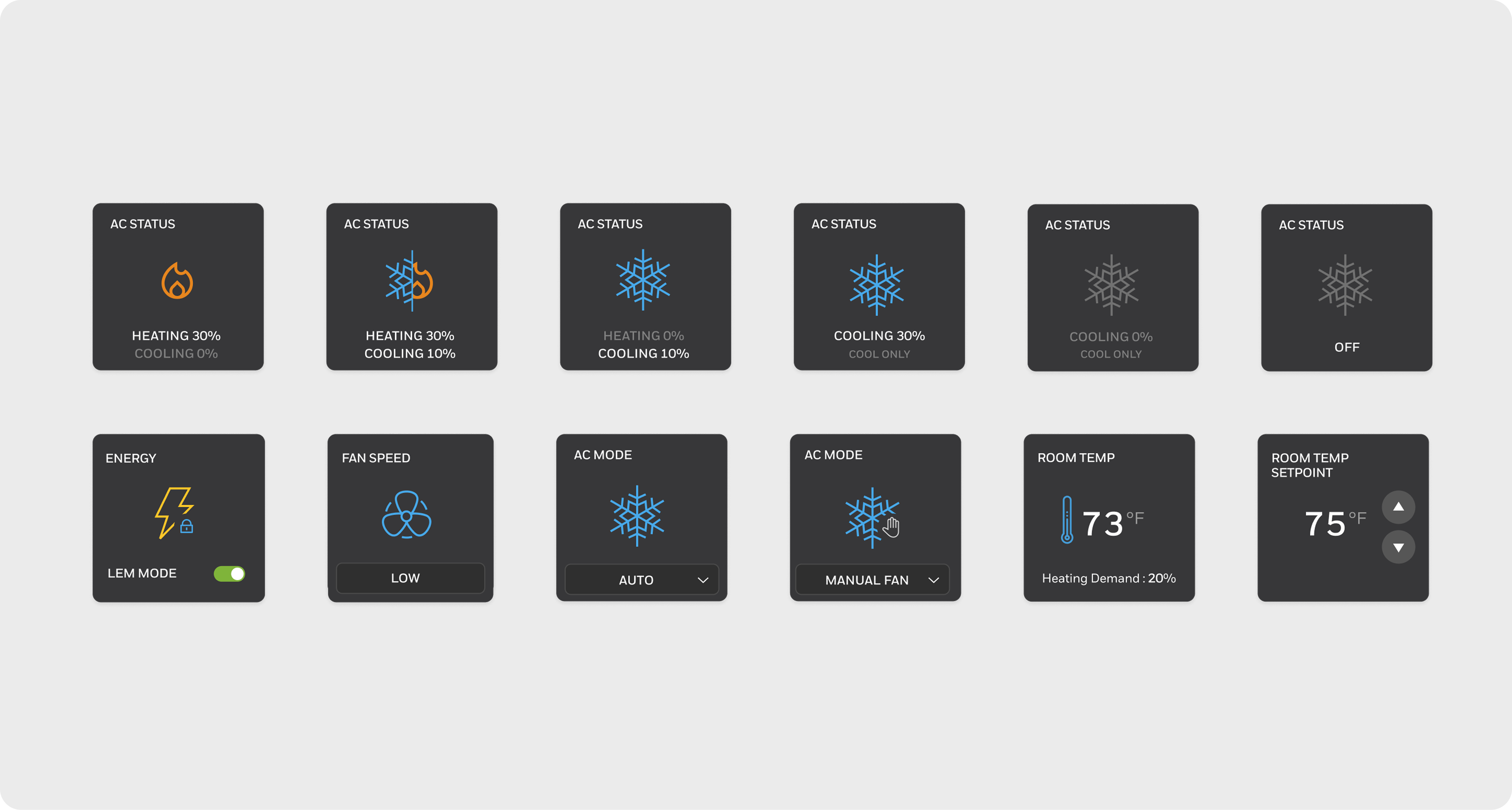
Room Dashboard
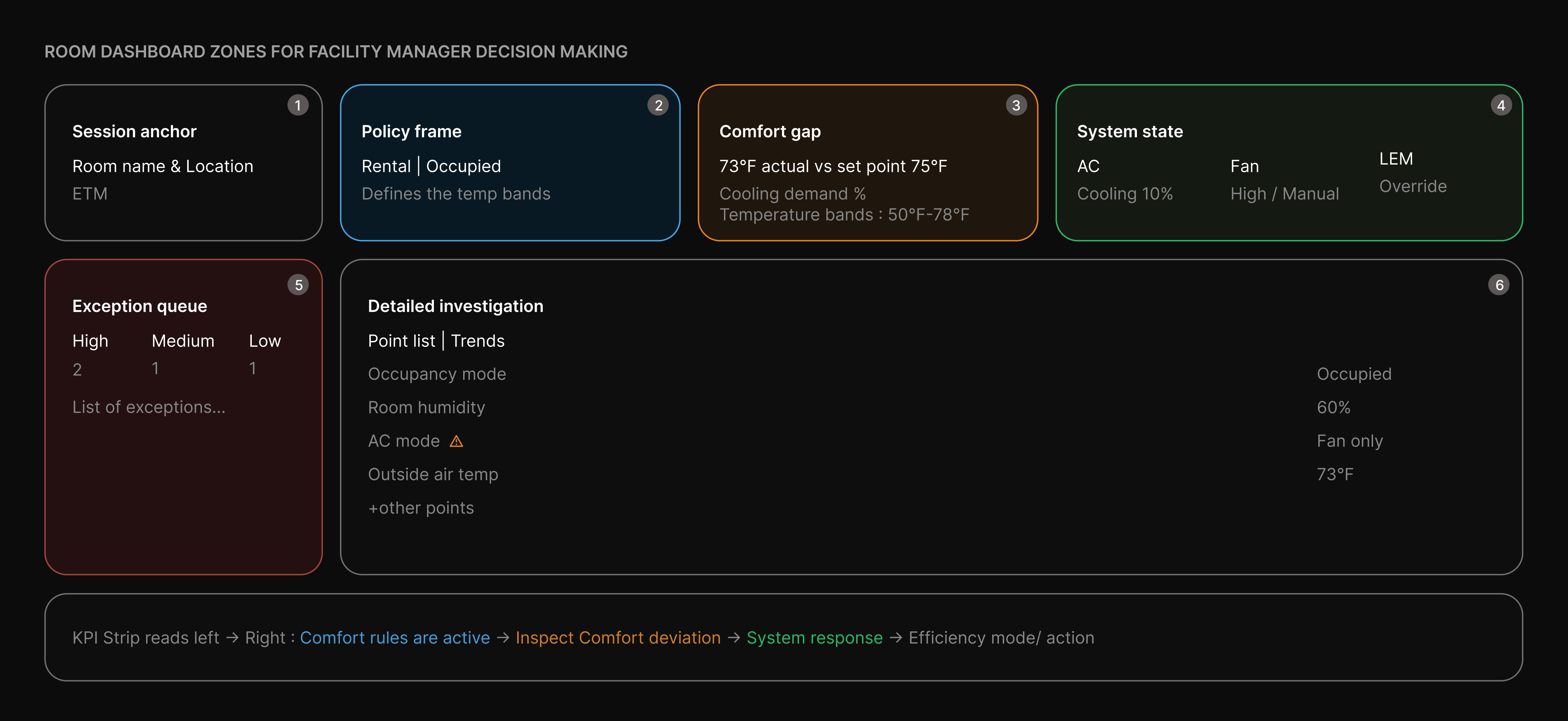
1. Session anchor — confirm room and connectivity
Room details and ETM mode establish context upfront. Online status is the first gate — if offline, remote control isn’t possible and all other data becomes secondary.
2. Policy frame — what comfort rules are active?
PMS-driven rental and occupancy define the active temperature band. Sets the context for interpreting all readings — action only matters when the room is rented and occupied.
3. Comfort deviation — is the guest comfortable?
Temp vs set point reveals deviation instantly. Cooling demand indicates system effort, while band limits confirm if settings are within policy.
4. System configuration — is the HVAC behaving correctly?
AC mode, fan speed, and LEM explain why deviations occur. Highlights manual overrides and energy compliance against expected behaviour.
5. Exception triage — alarms pushed, data pulled
Alarms surface priority issues by severity and repeat frequency. Data tables are secondary — used only for deeper investigation after anomalies are identified.
Wires & low-fidelity prototypes
We ran 4–5 rounds of stakeholder reviews and usability testing — measuring task completion rate and time on task — iterating until operators could find critical information and respond to alarms without any guidance.
INNCOM Direct
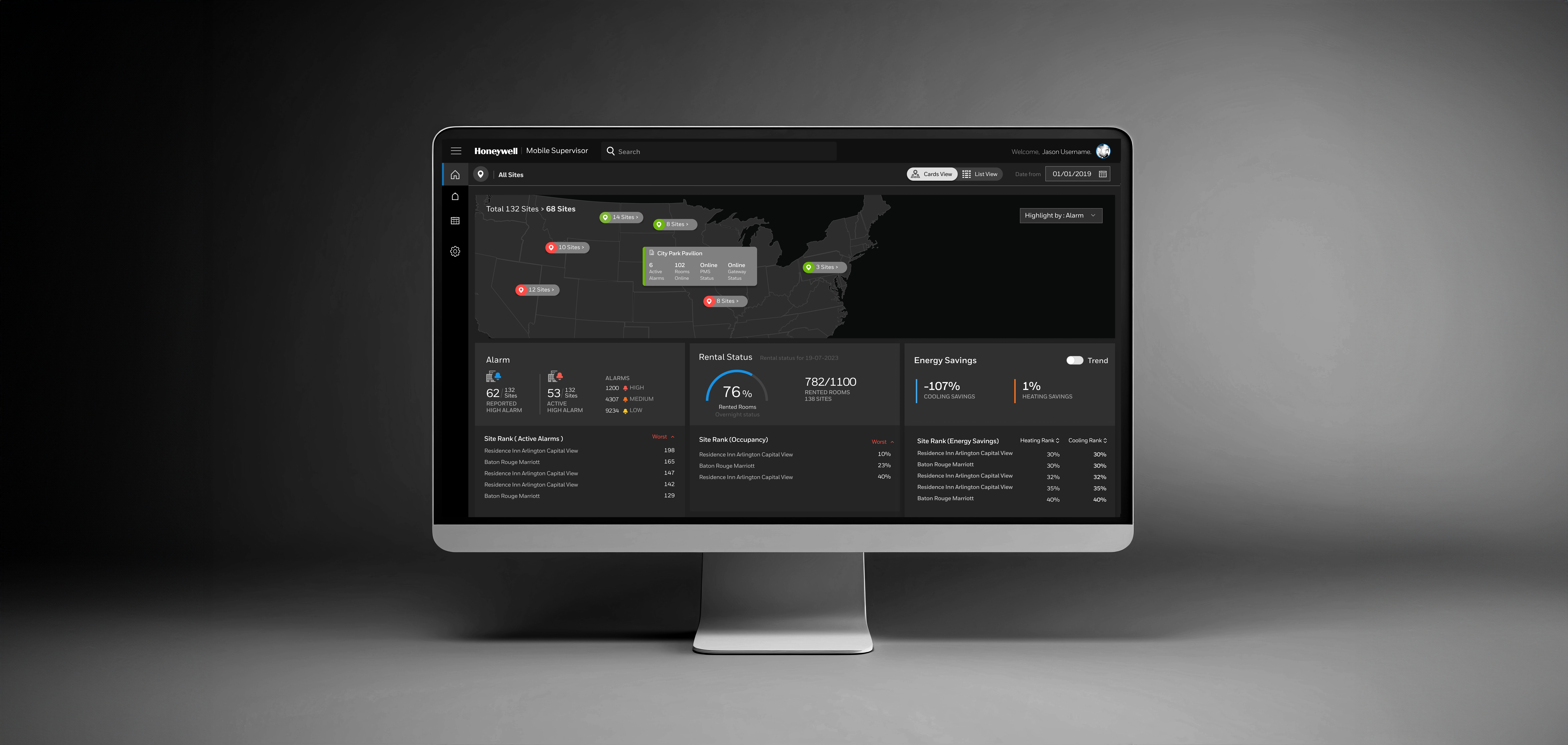
INNCOM Direct is launched as a cloud based supervisory platform accessible on mobile and desktop, designed for both single properties and multi-hotel portfolios
Building for scale
INNCOM Direct was designed to be adopted globally — across different languages, screen sizes, and technical environments. Accessibility and system consistency weren't afterthoughts.
Shipped August 2024 — results that matter
Unified Supervisory Platform
On August 14, 2024, the application launched with a redesigned supervisory platform, consolidating multiple tools into a single cloud-based flow.
Portfolio-Level Visibility
Portfolio managers gained the ability to monitor up to 50 properties from one dashboard, enabling brand-wide strategies for guest comfort and energy management.
Energy Efficiency Gains
Occupancy-based temperature bands delivered measurable energy savings of up to 30%, aligning operational efficiency with sustainability goals.
Centralised Command Centre
For the first time, facility managers had a portfolio dashboard that served as a single command centre, streamlining oversight and decision-making.
Operational Impact
Early usage data revealed significantly faster alarm response times compared to the previous fragmented setup, demonstrating immediate improvements in responsiveness and reliability.